
The bear market in bonds is a trend, with three fundamental causes
The most under-appreciated feature of the current bear market in bonds is also the most obvious one. Trend. That trend drives asset prices is not in dispute – in its many guises it is probably the dominant strategy in global capital allocation. Yet in all the commentary I read on the bond market, it goes almost entirely unmentioned. Instead we get hand-wringing over public sector debt.
To the extent that there is a fundamental story behind the trend, three drivers are at the top of the list: a structural break in Japan; the entirely conventional cyclical behaviour of bonds and equities; and the sign of the bond-equity correlation in the last three years’ risk events. The narrative that dominates – that this is about public sector debt – has almost no empirical support outside the euro area.
Structural break in Japan
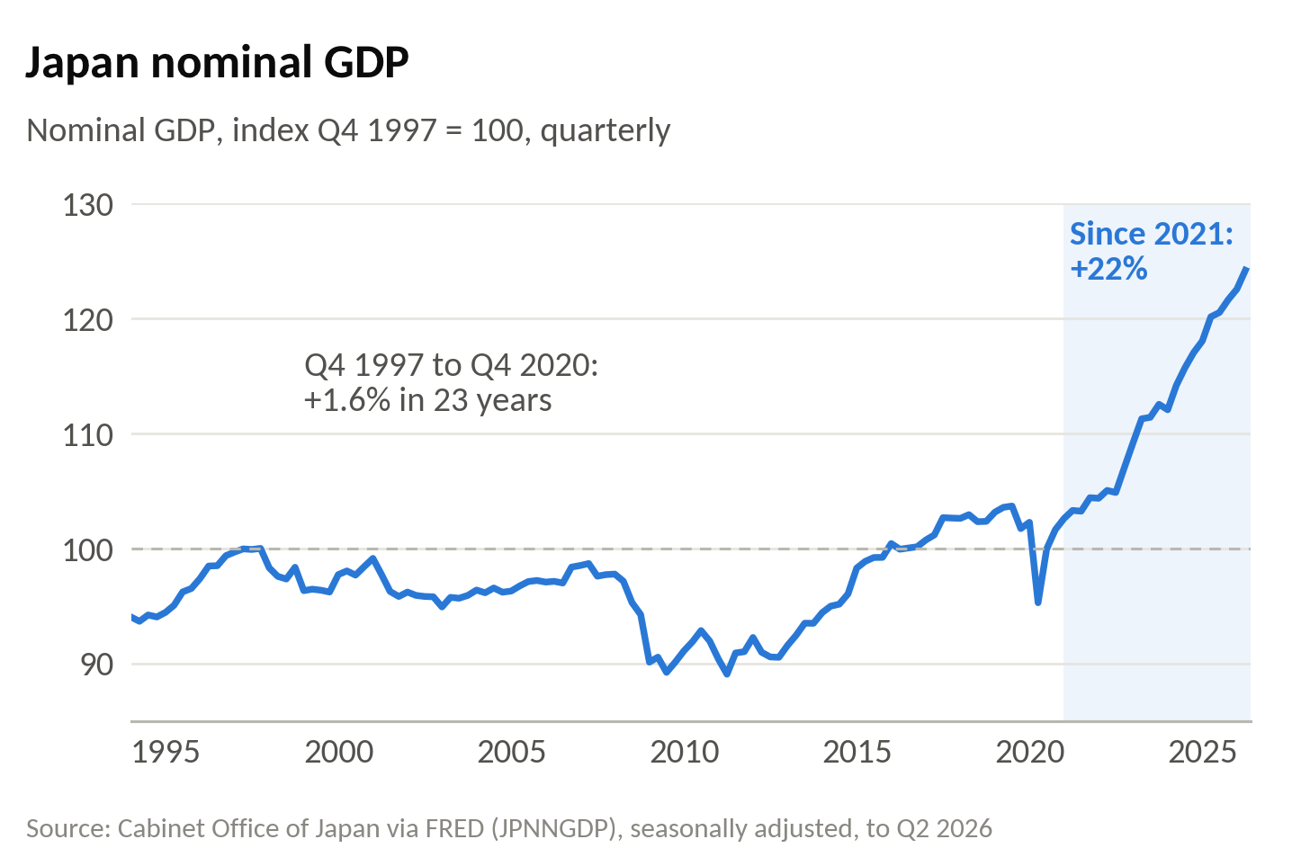
From the Asian crisis in 1997-98 until 2021, Japanese nominal GDP grew at roughly zero, due to deflation and small positive real growth. A 30-year JGB yielding close to zero was a logical counterpart. From 2021 there has been a clear structural break: nominal GDP has compounded at more than 3% a year. This explains the unrelenting trend higher in the 30-year JGBs to 4%.
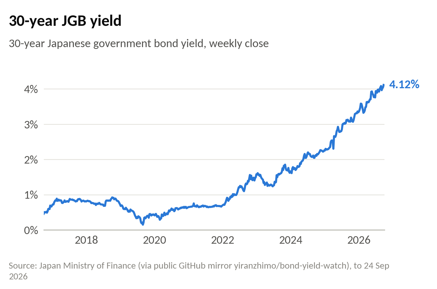
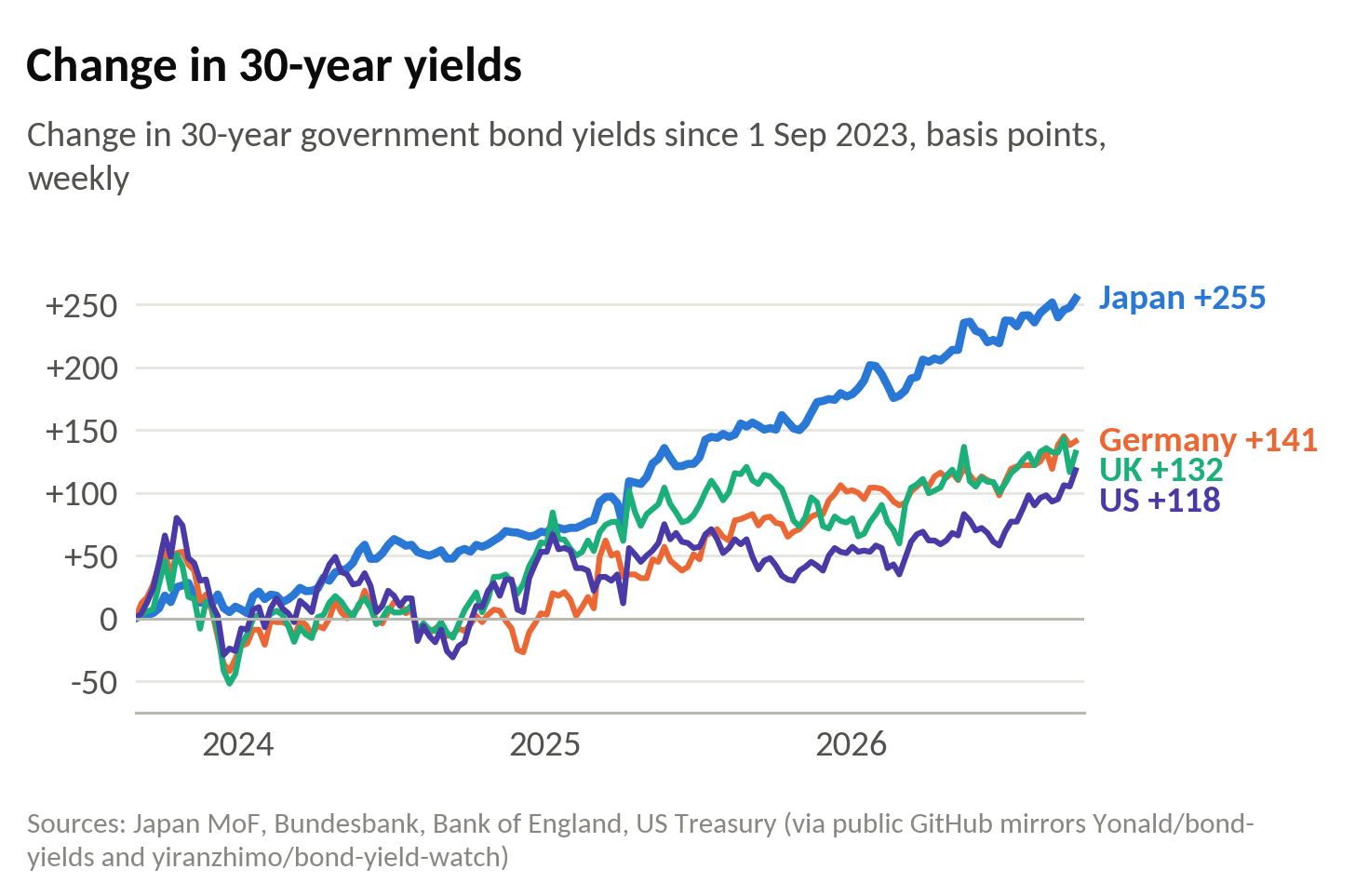
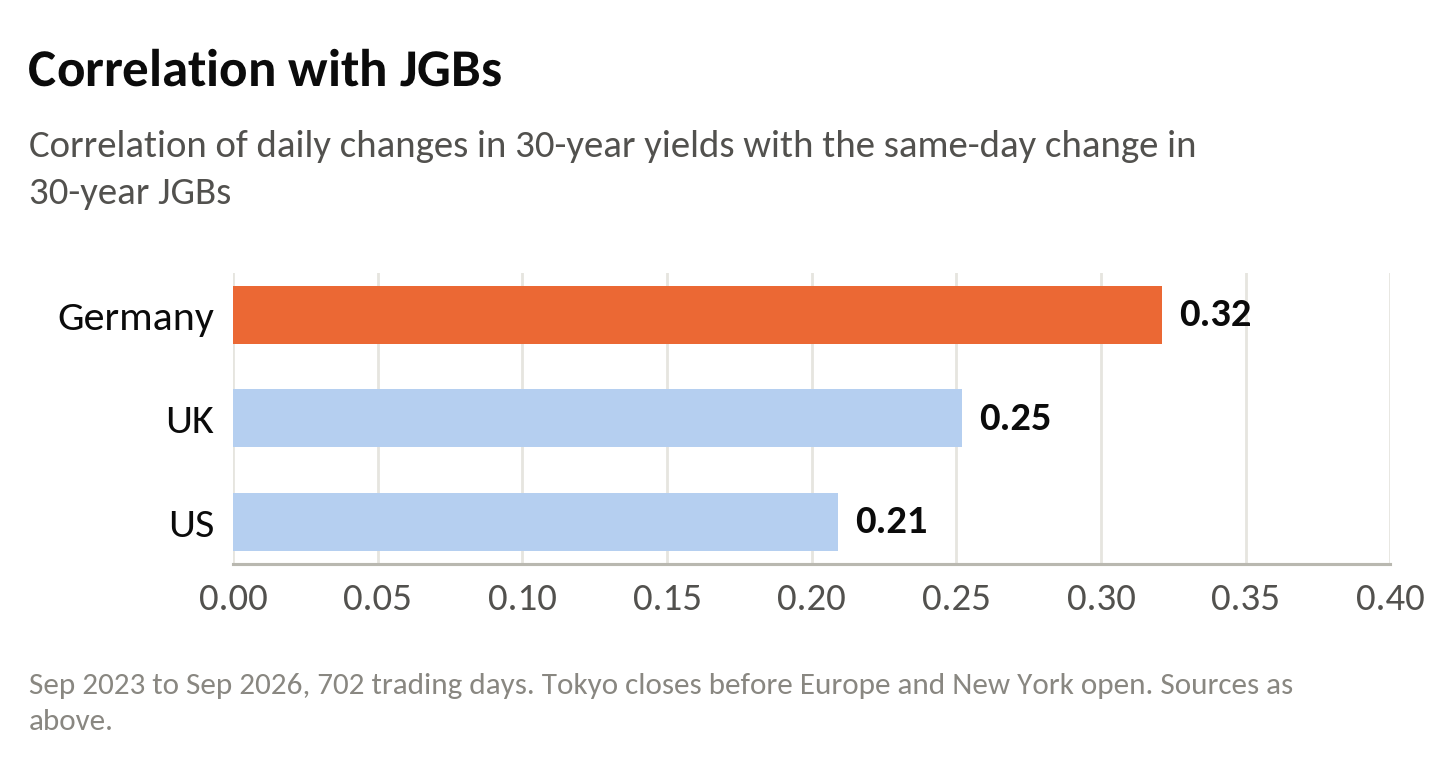
What is less appreciated is how much of the global bear market at the long end of bond markets is due to Japan. Over the past four years, most of the local highs in global yields have coincided with accelerations in the JGB sell-off and local peaks in Japanese yields. (The most recent episode is a notable exception – this time Treasuries were the epicentre.) Contagion from Japan also explains cross-sectional performance in recent years. Why has the long end of Germany been among the worst performing bond markets in the world? Not because of German debt, which is the lowest in the G7. Not because of an inflation dynamic, nor the absence of a credible central bank. Bunds sold off because, in factor terms, they are the closest thing to a JGB.
Since September 2023 the 30-year JGB has risen by 255 basis points. The 30-year Bund has risen by 141 – more than gilts or Treasuries, despite Germany having the lowest debt of the four. And day to day, Bunds are the market that moves most closely with JGBs.
Bonds did what bonds do
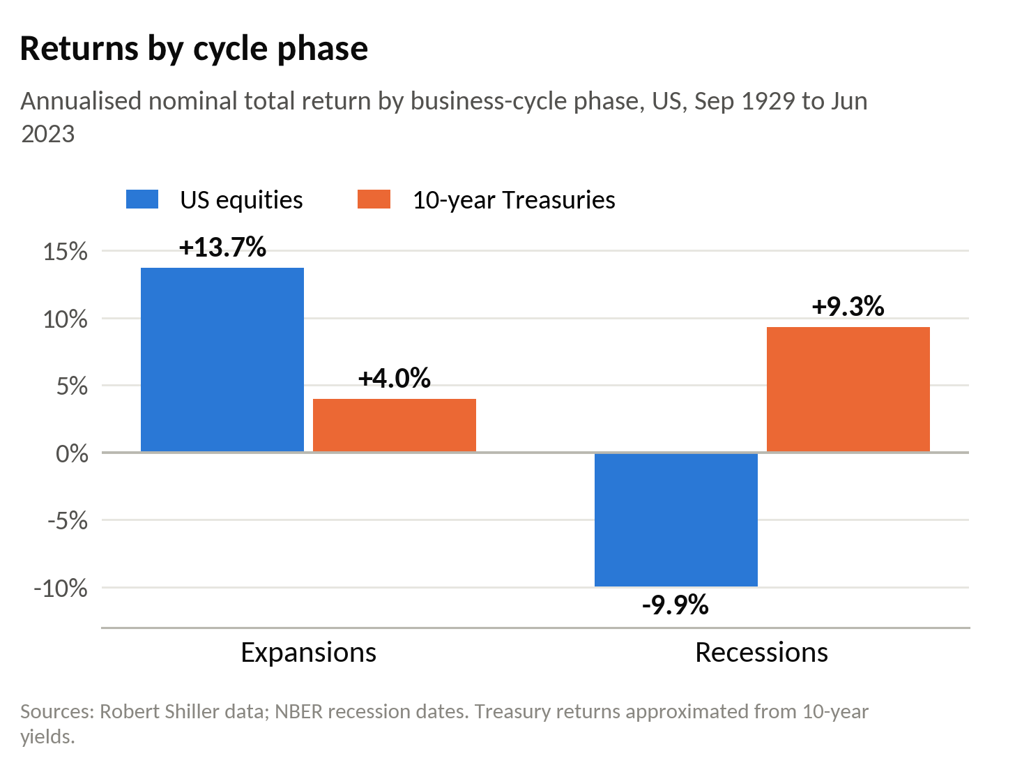
There are broadly two empirical findings in finance worth taking seriously. The first is that carry works: starting yield is a powerful predictor of subsequent returns. The second is that equity returns are pro-cyclical and bond returns are counter-cyclical. Bonds do well in recessions; equities do well in booms.
The definitive statement of the first finding is John Cochrane’s presidential address to the American Finance Association, ‘Discount rates’ [1]. Its punchline is almost embarrassingly simple: most of the variation in asset prices is variation in expected returns, not in expected cashflows. When prices are low relative to dividends, subsequent returns are high. That is carry by another name – and it holds across asset classes, as Koijen, Moskowitz, Pedersen and Vrugt show [2].
The second finding is central to the positive bond–equity correlation. Take calendar year 2026. Equities have gone up a lot – there has been a cyclical boom in US GDP – and bond yields have gone up a lot. That is precisely what the second finding predicts.
Fama and French showed in 1989 that expected returns on both stocks and bonds move with business conditions [3]. Ninety years of US data make the point without the econometrics:
Risk is a memory
The third driver is hardwired into risk models and formalised by every quantitative strategy: how bonds behave in left-tail events.
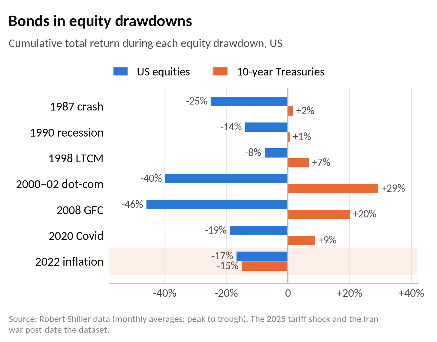
The term premium is a risk premium. A risk premium is the price of how you expect an asset to behave when things go badly. For roughly thirty years, the major shocks to equities were deflationary. The peso crisis was deflationary. The Asian crisis was deflationary. LTCM was perceived to be deflationary. The global financial crisis and the euro crisis were deflationary. In every case, bonds rallied as equities fell, and they provided genuine diversification. Individuals learnt this, and backward looking statistical risk models embedded it. The result was a secular decline in the term premium.
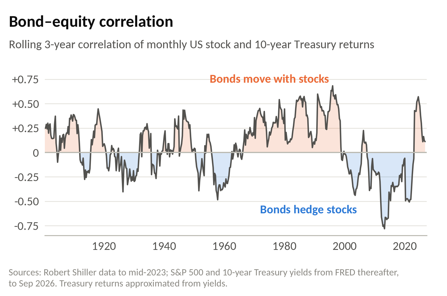
That learning has now reversed. In 2022, the post-Covid inflation shock and the war in Ukraine delivered a positive correlation with a negative sign: bonds and equities fell together. The tariff shock was an inflationary tail event, and US Treasuries specifically traded like a risk asset. The Iran war did it again. In each case, bonds did not provide protection – in a portfolio, they acted like leveraged equity risk. Three data points, arguably random in their origins, have reversed the sign of a thirty-year pattern, and risk models default to this sample period.
None of this is new to the academic literature. Campbell, Sunderam and Viceira showed that the sign of the bond–equity covariance depends on whether inflation is pro- or counter-cyclical: bonds were risky assets in the 1970s and 1980s and became hedges after 2000 [4]. The pictures are stark:
We have been here before
A good analogue for the current behaviour of the long end is the internet boom. The equity bubble of 1999–2000 was itself precipitated by a deflationary shock – Russia and LTCM in the fourth quarter of 1998 – and then fuelled by additional pro-cyclical liquidity from the Fed around Y2K. Bond yields rose as risk preferences shifted, and in opposition to fiscal trends. The 30-year Treasury yielded around 6.5% at a time when people were seriously discussing whether it would disappear altogether, as the Clinton administration ran substantial budget surpluses. Why would anyone buy a Treasury at 6.5% when you could make 30% in a tech stock in a month? The long end behaved in the dot-com boom exactly as it is behaving in the AI boom. And as you extended your time horizon from 2000, yields fell very substantially.
The Dalio fallacy
Which brings us to the prevailing narrative – the Dalio fallacy – that this is all about public sector debt. Among countries that issue their own currency, it has no empirical support. Take 10s30s as a crude proxy for the term premium. The United States, with gross debt of 124% of GDP, has a 10s30s curve of 33bp. Australia, with debt of around 50%, has one of 35bp. Canada, at 114%, is flatter than both at 29bp; the UK, at 102%, is steeper at 50bp. The correlation between debt and the slope across the four is −0.09. Nothing. The one outlier is Japan, but as we argued in our last post, the bear market in JGBs is repricing a structural break in nominal growth. The public sector balance sheet in Japan has in fact improved dramatically – largely due to the financial assets acquired during Covid.
The euro area is different, and the difference is instructive. Within the euro area the relationship is strong: Italy, France and Belgium have the steepest curves; Germany, Austria and Finland the flattest. The correlation is 0.87 – roughly 5bp of extra slope for every ten points of debt.
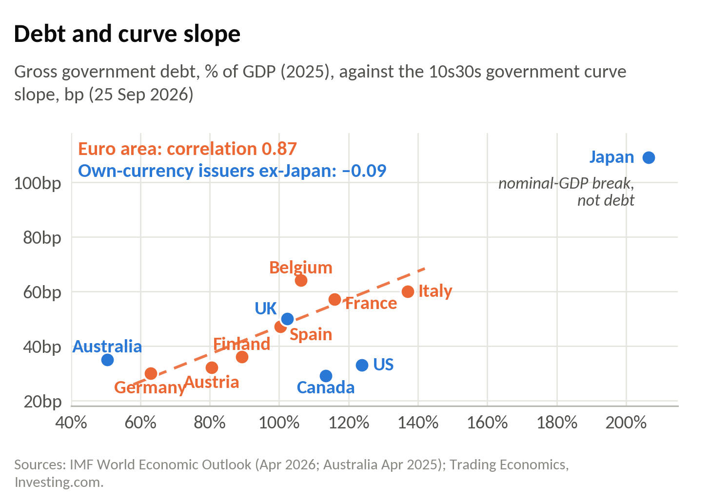
This is not a contradiction. It is the exception that proves the rule. A state that issues its own currency does not face credit risk on debt denominated in it. A member of the euro area does. Germany issues the safety asset in Europe. For Germany, a long bond is an interest rate. For France, it is an interest rate plus a credit spread. Debt matters where there is credit risk – and there is credit risk only where the state has surrendered its monetary sovereignty. Dalio has taken a feature of the euro area and mistaken it for a law of public finance.
Which is why France is a genuinely deflationary problem. French 10-year yields now trade above Italy’s – 4.73% against 4.50% on 25th September. A euro-area sovereign under market pressure is pushed into procyclical austerity, its banks’ holdings of its own bonds lose value, capital flees to Bunds, and credit conditions tighten across the currency union. We have seen this film before. Unless the ECB intervenes early and without conditions – and its Transmission Protection Instrument is conditional by design – euro crisis III would be a deflationary shock. And deflationary shocks are precisely when bonds outside the euro area do their job.
Where we are now
There is a high probability that we are in the vicinity of a local high in yields. We have had a confluence of idiosyncratic factors accelerating an existing trend: a new Fed chair mismanaging expectations, a renewed oil price shock, and some locally very strong US data – all landing in a strongly trending market to produce a relatively extreme move. The global backdrop is one of fairly stable nominal GDP growth and, outside the US, pretty poor nominal growth. The bear market has been global, and only in this latest phase has the US played a leading part. Until the recent breakout, US 30-year yields had been among the better behaved, more range-bound than trending.
In this latest phase, 30-year JGBs have been among the best performing bond markets in the world: since late May they have risen by around 20bp, against 40bp for Treasuries. They have barely exceeded their May highs. It is conceivable that the trend in Japanese bonds is nearing its end, given what is happening to the yen and the Bank of Japan’s willingness to declare victory over deflation by raising nominal rates.
On a three- to six-month view, if not sooner, a significant rally in bonds is very plausible – not least because there are always non-trivial probabilities of deflationary left-tail events. There is no shortage of candidates: France, which raises a material probability of euro crisis III; the tightening in credit conditions caused by the bond sell-off itself; and the cracks appearing in parts of the financial system, not least private credit. But these are, by their nature, unpredictable.
This is now largely about time horizon. Anyone making strategic asset allocation decisions should think very hard about one thing: the opportunity to buy genuine diversification. The probability of a severe economic shock increases with time.
The capex clock
There is nothing to suggest an imminent recession. Far from it. There may be a drip-feed of deflationary left-tail events – France is already on the list, and private credit or another financial accident is more probable given the shock to rates – but the real economic shock looks some way off. It will happen, though. Or at least, it has a high probability of happening, because capex cycles inherently embed overinvestment and the erosion of competitive or monopolistic power. The current boom is no different. Every tech company can offer you an agentic app, or soon will. The return on all that capital is profoundly uncertain.
But the most important reason capex cycles end in significant downturns is a mismatch in time horizon. You invest on the basis of today’s demand, and the capacity comes on stream in three to five years, when you have no idea what demand will be. The current shortage of semiconductors, and the extraordinary acceleration in their prices, reflects a mismatch against demand premised on the expectations of two or three years ago. A disequilibrium with the opposite sign is highly probable two to five years from now. And when a capex cycle turns, it is extreme – particularly for sensitive equity – because companies don’t need to do any capex at all. Investment can fall back to depreciation. You can see 70% declines in orders – and at some point we will.
To be clear, I see no evidence that any of this is imminent. In fact, the reverse – which explains the current acceleration in the bear trend in US bonds. My expectation is that the AI bubble will be one of the biggest and most extreme we have ever seen. Bubbles are social-psychological phenomena. They go on longer than you think, and typically beyond tangible deteriorations in fundamentals – that has been true of virtually every major bubble in the last fifty years. The bond yields will likely keep trending higher until the cycle breaks. The question is how long you are prepared to wait.
This post was written before the last two trading days’ price moves in French bonds. The rally in Bunds and gilts is consistent with the arguments made here.
References
[1] John H. Cochrane (2011), “Presidential address: Discount rates”, Journal of Finance 66(4), 1047–1108. Link
[2] Ralph Koijen, Tobias Moskowitz, Lasse Pedersen and Evert Vrugt (2018), “Carry”, Journal of Financial Economics 127(2), 197–225. Link
[3] Eugene Fama and Kenneth French (1989), “Business conditions and expected returns on stocks and bonds”, Journal of Financial Economics 25(1), 23–49. Link
[4] John Campbell, Adi Sunderam and Luis Viceira (2017), “Inflation bets or deflation hedges? The changing risks of nominal bonds”, Critical Finance Review 6(2), 263–301. Link
Data: Robert Shiller’s long-run US stock market and interest rate data (to mid-2023), extended to September 2026 in Figure 7 with S&P 500 and 10-year Treasury yields from FRED; NBER business-cycle dates; Cabinet Office of Japan via FRED; 30-year yields from the Japan Ministry of Finance, Bundesbank, Bank of England and US Treasury; 10-year and 30-year yields across countries from Trading Economics and Investing.com (25th September 2026); government debt from the IMF World Economic Outlook. Treasury returns are approximated from yields.
Featured image: 1884 Japanese government bond certificate, National Archives of Japan, via Wikimedia Commons, CC BY 4.0 (cropped).
.jpg)
Leave a Reply